|
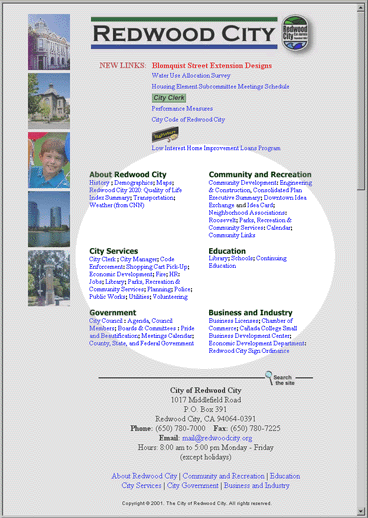
The main site content is presented in six categories, whose content is directly accessible from the home page. Unfortunately:
- The options under each category are presented in tiny text, with subtle dividers, making it very difficult to scan.
- Plain links (with no underlining) may be a poor convention to set for less computer-saavy users.
- Some sections are much longer than their neighbors, creating white space.
|
